Use and Create Widgets
Widgets are a valuable and easy way to customize your Activities and are the backbone of every themeable Activity.
Use Widgets in Activities
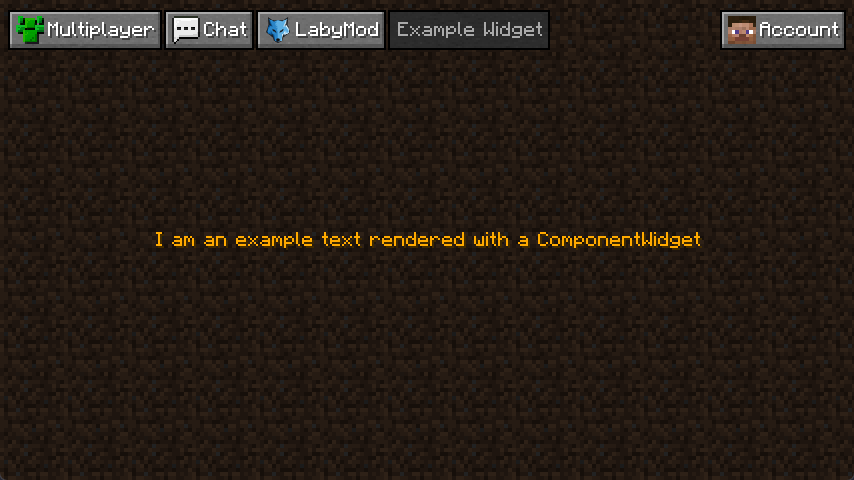
This part will show you how to use and integrate Widgets into your Activity. Looking back at our bare Activity example, we rendered the text "I am a bare rendered example text", so we'll be using a ComponentWidget just this time with the text "I am an example text rendered with a ComponentWidget". We're building onto the code from the previous example so if you haven't already gone through it, we recommend taking a look at it here.
Important Note
Remember that we're explaining the Activity System in multiple steps. This part of the page will explain how to create Activities with Widgets but without LSS. This is for example purposes only; we highly recommend using Widgets and LSS in your Activities, as the system is not optimized for Widgets without LSS. It is possible but don't expect your code to work forever; there is a high chance that the methods you use will be deprecated at any time.
Looking back at the bare Activity example, we remove the render method overwrite, as we don't need that anymore because the ComponentWidget will render the text for us. Now we overwrite the initialize method. Keep in mind that the super call has to be at the head of the method body. The method will be called any time the window is resized, the Activity is manually reloaded, or when the Activity was opened.
Then we create a new ComponentWidget. In this case, we will create a non-translatable ComponentWidget by calling ComponentWidget.text and declare our text as the first parameter. Because we want our text to be colored, we'll set the color of our choice as the second parameter, in this case, Gold. The call should look like this in the end: ComponentWidget.text("I am an example text rendered with a ComponentWidget", NamedTextColor.GOLD). Now we just declare it as a field and call this.document().addChild(this.componentWidget) as this will add the ComponentWidget to our Activity.
Theoretically, we could start the client, and our text would be rendered. But we haven't set the position yet. We'll only look at LSS in the next part, so we need to set the position with our Java code. To do this, we need to overwrite the protected void postStyleSheetLoad and again keep the super call as it notifies all child widgets that the style sheets have been loaded. We don't use those yet, but we leave the call in anyways. This method is called when all style sheets have been loaded and applied, just as the name suggests.
Now we get the bounds of our activity with this.bounds() and the bounds of our ComponentWidget via this.componentWidget.bounds() and set the position of said widget with widgetBounds.setPosition(activityBounds.getCenterX(), activityBounds.getCenterY(). As we want the ComponentWidget to be centered we need also to add this.componentWidget.alignmentX().set(WidgetAlignment.CENTER) and this.componentWidget.alignmentY().set(WidgetAlignment.CENTER) this centers the Widget horizontally and vertically.
Widget Activity Result
Like with the bare Activity, this is what the code we described above would look like:
@AutoActivity
public class ExampleWidgetActivity extends SimpleActivity {

  private ComponentWidget componentWidget;

  @Override
  public void initialize(Parent parent) {
    super.initialize(parent);

    this.componentWidget = ComponentWidget.text(
        "I am an example text rendered with a ComponentWidget",
        NamedTextColor.GOLD
    );
    this.document().addChild(this.componentWidget);
  }

  @Override
  protected void postStyleSheetLoad() {
    super.postStyleSheetLoad();

    Bounds activityBounds = this.bounds();
    Bounds widgetBounds = this.componentWidgetBounds.bounds();
    componentWidgetBounds.setPosition(
        activityBounds.getCenterX(),
        activityBounds.getCenterY()
    );

    this.componentWidget.alignmentX().set(WidgetAlignment.CENTER);
    this.componentWidget.alignmentY().set(WidgetAlignment.CENTER);
  }
}
Create Your Own Widget
You cannot only use the Widgets we created, but you can also create your own ones. This small example will show you how to create your first Widget and add it to your Activity. The result of our little example will be a widget that displays a player's head to the left and a player's name. This Widget will be applied in a vertical list with multiple entries.
Important Note
As it would be too complex to explain how to create a Widget without LSS, as of now you can only find an explanation on how to create Widgets here.
All Widgets
Below listed are all Widgets for use. They can be extended and modified for a more specific use case.
Every Widget also has the LSS Properties from AbstractWidget
Important Note
The LSS Properties noted here might be outdated and/or incomplete.
Input Widgets
Input Widgets are Widgets that allow direct user input.
Button
The ButtonWidget is an Input-Widget that performs a specific action (set with setPressable(Pressable)) when pressed.
It can be created with a String with ButtonWidget.text and a Component with ButtonWidget.component.
The Widget has the following LSS properties:
- Everything from
HorizontalListWidget(because the Button can have an Icon) - icon
Check Box
The CheckBoxWidget is an Input-Widget that switches between two states (CHECKED and UNCHECKED) when pressed but can also have the state PARTLY, but that can only be set via setState(State).
It can be created with the default constructor (no arguments needed).
The Widget has no own LSS properties.
Color Picker
The ColorPickerWidget is an Input-Widget that opens an Overlay when clicked where the user can select a specific color.
It can be created via its constructor.
The Widget has no own LSS properties.
Dropdown
The DropdownWidget is an Input-Widget that opens an Overlay when clicked in which the user can select an entry.
The Widget is generic; you have to specify the type of the entries (preferably String or any Enum) as the argument.
Entries can be added with add(GenericType), addAll(GenericType[]) and addAll(List<GenericType>).
Translatable by calling translationKeyPrefix(String),
It can be created with the default constructor (no arguments needed).
The Widget has no own LSS properties.
Keybind
The KeybindWidget is an Input-Widget that allows the user to set a specific Key.
It also accepts mouse buttons when expressly set with acceptMouseButtons(Boolean).
It can be created via its constructor.
The Widget has the same LSS properties as TextFieldWidget.
Multi Keybind
The MultiKeybindWidget is an Input-Widget that allows users to set multiple keys simultaneously.
It can be created via its constructor.
The Widget has the same LSS properties as TextFieldWidget.
Slider
The SliderWidget is an Input-Widget that allows users to select a specific number inside a set range (default is 0-100).
The Range can be set with range(Float, Float) and the steps with steps(Float).
It can be created via its constructor.
The Widget has no own LSS properties.
Switch
The SwitchWidget is an Input-Widget that allows the user to enable or disable a certain feature.
Can be created with SwitchWidget.create(Switchable), SwitchWidget.text(String, String, Switchable) or SwitchWidget.translatable(String, String, Switchable).
The Widget has no own LSS properties.
Text Field
The TextFieldWidget is an Input-Widget that allows the user to type in any text.
Typed-in text can be validated by calling validator(Predicate).
It can be created with the default constructor (no arguments needed).
The Widget has the following LSS properties:
cursor-color- the color of the cursor (default iswhite)font-size- size of the text (default is1.0)mark-color- the color of the marked background (default is-1)mark-text-color- color of the marked text (default isrgb(32, 32, 170))place-holder-color- the color of the placeholder text (default isdark-gray)text-alignment-x- eitherleft,centerorright(default isleft)text-alignment-y- eithertop,centerorbottom(default istop)text-color- the color of the text (default iswhite)type- eitherdefaultorvanilla-window(default isdefault)
Grid Widgets
Grid Widgets are Widgets that automatically set the position of children in a specific way.
Horizontal List
The HorizontalListWidget is a Grid-Widget that displays all its entries in a horizontal list. Add entries by executing addEntry(Widget).
It can be created with the default constructor (no arguments needed).
The Widget has the following LSS properties:
layout- the layout of the list - eitherspread,fillorstack(default isstack)space-between-entries- the space between each entry (default is1)
Tiles Grid
The TilesGridWidget is a Grid-Widget that displays all its tiles in a specific grid that can be set via LSS.
The Widget is generic; you have to specify the type of widgets you want to add as the argument. Tiles can be added via addTile(GenericType).
It can be created with the default constructor (no arguments needed).
The Widget has the following LSS properties:
space-between-entries- the space between each entry (default is0)tile-height- the height of the tiles - set to-1to make the tiles a square (default is-1)tiles-per-line- the number of tiles per line (default is3)
Vertical List
The VerticalListWidget is a Grid-Widget that displays all its entries in a vertical list.
The Widget is generic; you have to specify the type of widgets you want to add as the argument. Children can be added via addChild(GenericType).
It can be created with the default constructor (no arguments needed).
The Widget has the following LSS properties:
list-alignment- the alignment the children should have inside the list - eithertop,centerorbottom(default istop)list-order- the order of the children - eithernormalorreverse(default isnormal)overwrite-width- if the width of children should be set to the with of the list (default istrue)render-out-of-bounds- if the children should be rendered out of bounds, it makes sense if the Widget is inside aScrollWidget(default isfalse)selectable- if the children should be selected on click (default isfalse)space-between-entries- the space between each entry (default is1)squeeze-height- if children that would have been rendered out of bounds should be squeezed to stay in the bounds (default isfalse- use with caution!)
Utility Widgets
Utility Widgets are Widgets that can be useful for any Activity.
Component
The ComponentWidget is a Utility-Widget that displays any Component.
Can be created with ComponentWidget.text, Componentwidget.i18n and ComponentWidget.component. Each factory method has multiple implementations.
The Widget has the following LSS properties:
allow-colors- if the color of the component should be used (default istrue)font-size- how much the component should be scaled (default is1.0)line-spacing- the spacing between multiple lines ifoverflow-strategyiswrap(default is0.0)max-lines- the number of maximum lines that should be displayed ifoverflow-strategyiswrap(default is0, set to0to disable)overflow-strategy- the strategy that is applied when text is longer than the bounds allow - eitherwraporclip(default iswrap)scale-to-fit- if the component should be scaled to fit the bounds if it would overflow (default isfalse)shadow- if the component should have a shadow (default istrue)text-color- the color of the component (default is-1, set to-1to disable)
Div
The DivWidget is a Utility-Widget that does nothing special, as it is just an implementation of SimpleWidget and can be used for creating simple containers without automatic alignment.
It can be created with the default constructor (no arguments needed).
The Widget has no own LSS properties.
Fading
The FadingWidget is a Utility-Widget that slowly fades out at a specific timestamp.
It can be created with either FadingWidget.until(Widget, Long) to specify a timestamp or FadingWidget.forMillis(Widget, Long) to specify the milliseconds until the Widget fades.
The Widget has no own LSS properties.
Hr
The HrWidget is a Utility-Widget that acts as a separator between Widgets.
It renders a line with the size of the Widget's inner bounds (only in the Fancy Theme!)
It can be created with the default constructor (no arguments needed).
The Widget has no own LSS properties.
Icon
The IconWidget is a Utility-Widget that renders an Icon.
It can be created via its constructor.
The Widget has the following LSS properties:
icon- the rendered Icon (the argument sets the default value in the constructor)color- the color of the Icon (default is-1)object-fit- the fit of the Icon inside the Widget's bounds - eitherfill,contain,cover,scale-downornone(default isfill)clickable- if the Icon should be slightly zoomed when hovered (default isfalse)
Screen Renderer
The ScreenRendererWidget is a Utility-Widget that renders any Activity inside the bounds of the Widget.
It can be created with its constructor. Calling the default constructor doesn't forward the style.
The Widget has the following LSS properties:
interactable- if the user should be able to interact with the rendered screen (default istrue)
Scroll
The ScrollWidget is a Utility-Widget that allows scrolling Widgets vertically (preferably VerticalListWidget or TilesGridWidgets).
It automatically adds a ScrollbarWidget as its second child.
The child has to have their height set to fit-content, and the ScrollWidget's height has to be fixed for everything to work.
Can be created with either new ScrollWidget(VerticalListWidget) or new ScrollWidget(Widget, ListSession<>).
The Widget has the following LSS properties:
enable-scroll-content- if content should be scrolled when dragging the mouse (default isfalse)scrollSpeed- how fast the content should be scrolled (default is-1, set to-1to calculate the scroll speed automatically based on the number of children)child-align- where the content should be aligned - eithertop,centerorbottom(default istop)
Scrollbar
Abstract Widgets
Abstract Widgets are not for direct use and are therefore intended exclusively for inheritance and extension.
Abstract Widget
The AbstractWidget is the main implementation of almost every Widget.
The generic type declares the type of its children.
The Widget and, therefore all inheriting Widgets have the following LSS properties (if no default value is specified, the default value is null, and the property has to be set to take effect)
As there are so many, they are split into different sections:
Positioning (Bounds)
Every property (except the padding and margin allrounder) in this section can also have a percentage. The width: 5% will result in the width being 5% of the parent's width.
left- the relative left position to the parenttop- the relative top position to the parentright- the relative right position to the parentbottom- the relative bottom position to the parentwidth- the width (can be a number but alsofit-contentorheight)height- the height (can be a number but alsofit-contentorwidth)max-width- the maximum width (useful when the widget has no fixed width)max-height- the maximum height (useful when the Widget has no fixed height)min-width- the minimum width (useful when the Widget has no fixed width)min-height- the minimum height (useful when the Widget has no fixed height)padding- the padding (has to be this format:TOP RIGHT BOTTOM LEFTor just one number to set the same padding in all directions)padding-top- the padding at the top (default is0.0)padding-right- the padding at the right (default is0.0)padding-bottom- the padding at the bottom (default is0.0)padding-left- the padding at the left (default is0.0)margin- the margin (has to be this format:TOP RIGHT BOTTOM LEFTor just one number to set the same margin in all directions)margin-top- the margin at the top (default is0.0)margin-right- the margin at the right (default is0.0)margin-bottom- the margin at the bottom (default is0.0)margin-left- the margin at the left (default is0.0)alignment-x- the horizontal anchor point of the widget - eitherleft,centerorright(default isleft)alignment-y- the vertical anchor point of the widget - eithertop,centerorbottom(default istop)use-floating-point-position- if the position should use Float instead of Integer (default isfalsein Vanilla- andtruein Fancy-Theme)fit-outer- if fit-content should be applied to the outer instead of the inner bounds of the children (default isfalse)box-sizing- how the width and height should be calculated - eithercontent-boxorborder-box(default iscontent-box)
Visual
animation-duration- the duration of the animation - in milliseconds (default is0)animation-timing-function- how animations should be interpolated - eitherlinear,ease-in-out,ease-inorease-out(default isease-in-out)background-color- the color of the background (default is 0, set to 0 to disable)background-dirt-brightness- the brightness of the dirt background (default is32)filter- filters that should be applied - possible areblur(RADIUS)andstencil-backgroundfont-weight- the weight of the fontopacity- the opacity - has to be between0.0and1.0(default is1.0)render-children- if the children should be rendered (default istrue)renderer- whichThemeRendererthe Widget usesscale- the scale in which the Widget is rendered (default is1.0)visible- if the widget is visible or not (default istrue)
Behavioral
always-focused- if the Widget should always have the attributeFOCUSED(default isfalse)background-always-dirt- if the background should always stay dirt, even if ingame (default isfalse)background-dirt-shift- the shift of the dirt backgrounddraggable- if the Widget can be dragged (default isfalse)interactable- if the widget can be interacted with (default istrue)mouse-render-distance- in which distance to your mouse the Widget will get visible (default is0.0, set to0.0to disable)pressable- if clicking the widget fires thePressablecallback (default istrue)priority-layer- depending on what is set the Widget will be rendered before everything else or after - eithervery-back,back,normal,front,very-front(default isnormal)stencil- if the widget content should not be able out of bounds (default isfalse)
List Widget
The ListWidget is the parent of every list like Widget.
The Widget has no own LSS properties.
Simple Widget
The SimpleWidget inherits AbstractWidget and removes the generic.
The Widget has no own LSS properties.
Wrapped Widget
The WrappedWidget is a "pseudo Widget" that wraps around its child and acts like it.
The Widget has no LSS properties as it redirects everything to its child. deprecated!